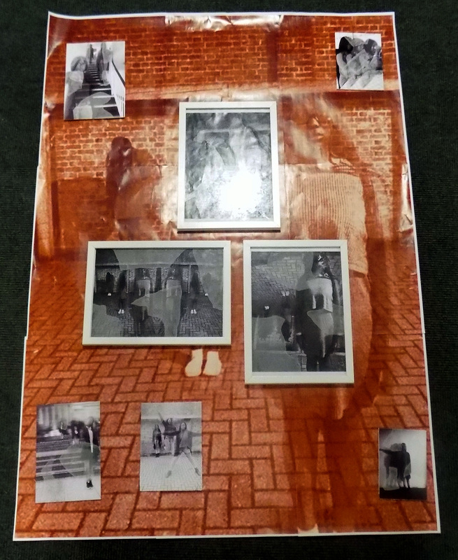
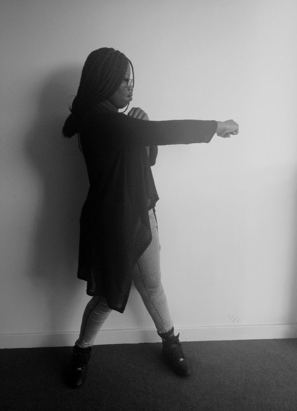
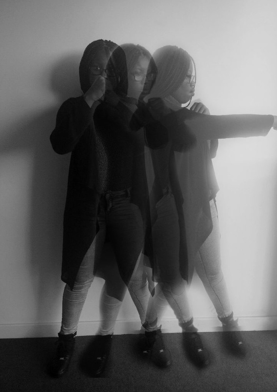
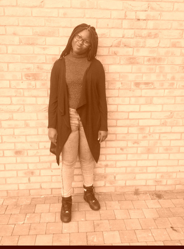
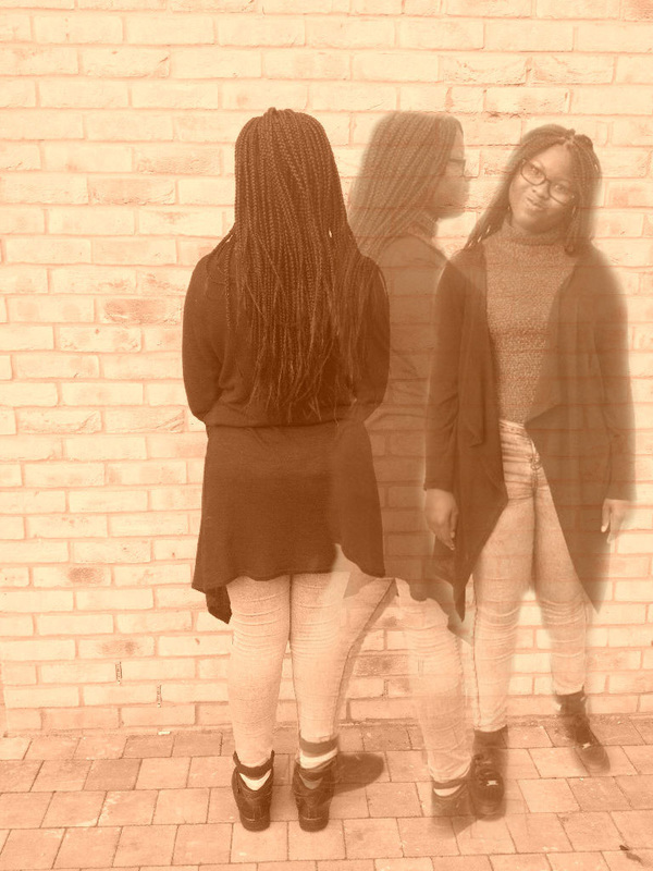
Idea 1 Development
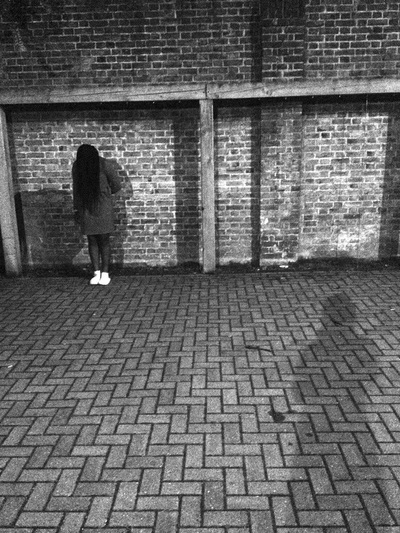
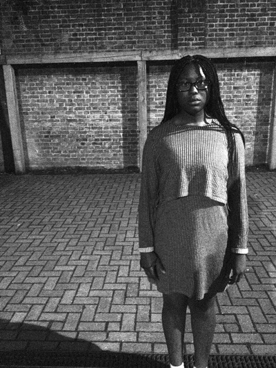
Original shots
|

|
|
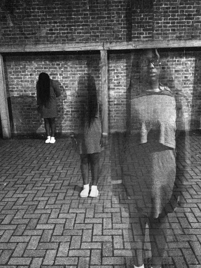


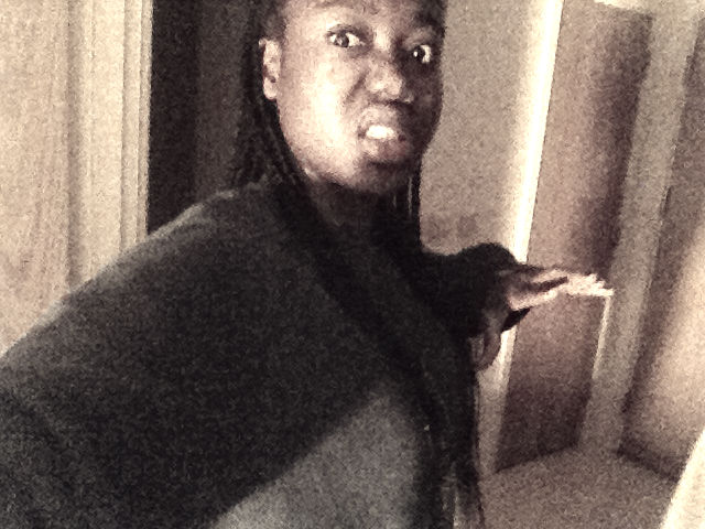
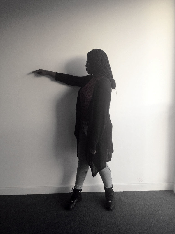
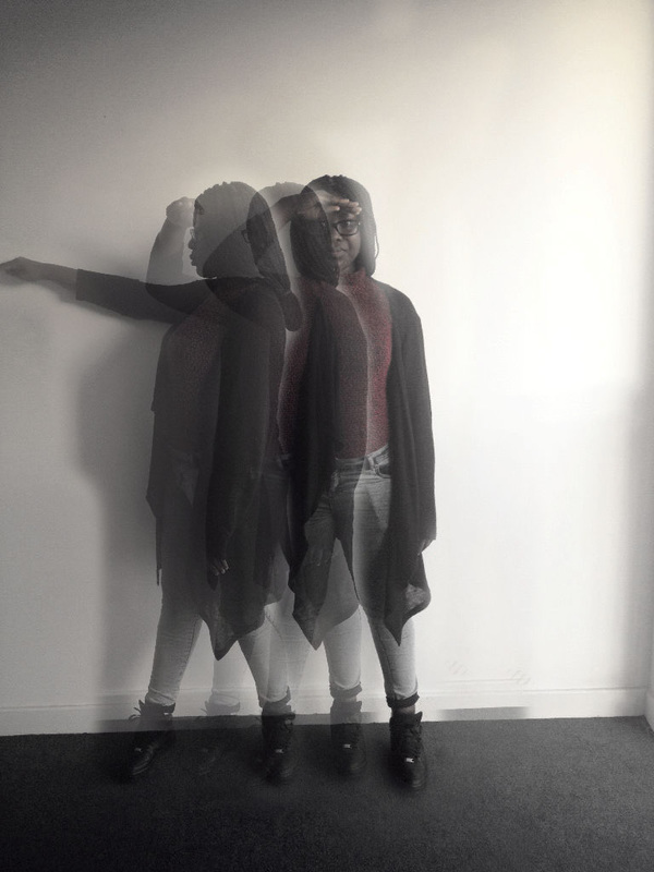
Out of all my idea 1's, this photo is my favorite. For this photo I wanted to follow the theme of horror or maybe something that feels and looks scary. I took 3 shots of my model in different positions. The first shot was of her standing in a car park in the far corner with all of her hair covering her face and her head bent down, also with her hands by her side, all this with a lot of space left towards the right. The next shot is off her standing slightly forward, in the middle and with all of her covering her face again, head bent and her hands by her side. he last photo is of her standing closer to the camera, standing in the far right, with her hands by her side and her hair not covering her face anymore. I edited this photo by cropping, adding black and white and by levelling the colours. For the development I layered all the shots together, used the rubber tool to rub out the parts of the photo I didn't want and I lowered the opacity. Next I copied and flipped the photo, to create a mirror effect. Finally I added a filter called poster edges. I really like this photo because of the filters used , it makes the photo look very interesting and I also like this photo because of the theme that is well presented. From making this photo I have learnt that the mood and the setting used in your photo is very important as it makes your photo even better.
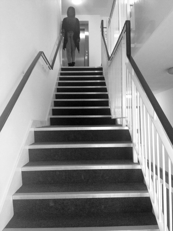
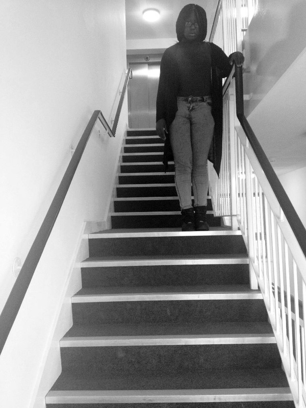
Idea 2 development
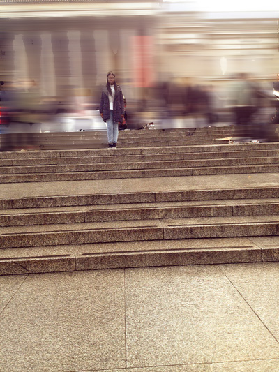
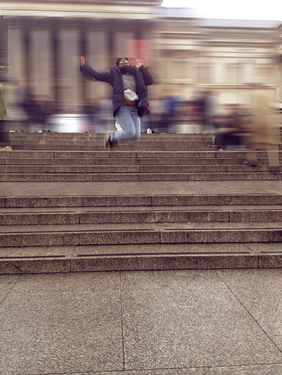
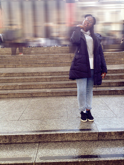
Original shots
|
|
|
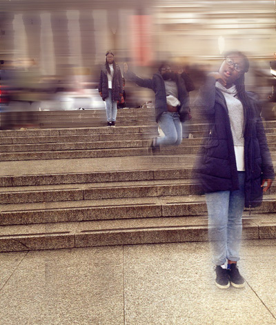


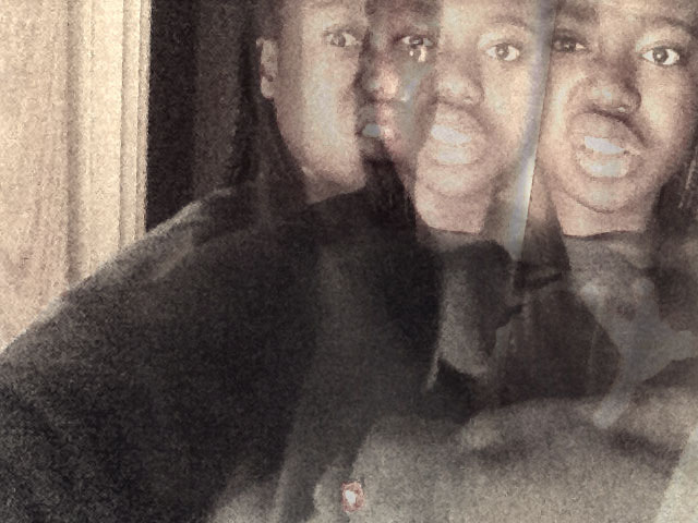
Out of all idea 2's, my first development is my favorite one. For this photo I went to central London to take the photos, at Trafalgar Square. For the first shot I took a photo of my model at the top of the stairs looking at the camera, hands by her side and in the far left. The second shot is of her slightly in the middle of all the steps and jumping up in the air. The last shot is of her standing in at the bottom of all the stairs and at the far right. I edited these photos by cropping and levelling the colours. For the development I layered all the photos together, used the rubber tool to rub out parts of the photos I didn't want, blurring the background, I lowered the opacity and I added a filter called poster edges. Finally I made a copy of the photo and flipped it to create a mirror effect. I really like this photo because of the edits used in the photo. To improve this photo I could of used 2 people to make it even more interesting. From making this development I have learnt to try and minimise the background clutter.
Idea 3 development
Original shots
|

|

|


For this photo I took shots of my model at different angles, one of her turned facing the right, the second of her slightly turned towards the camera and the last photo of her facing the camera. I edited these photos by cropping, levelling the colours. For the development I layered all the photos together, used the rubber tool to rub out the parts of the picture I didn't want. I also copied the photo 3 times and flipped all of the photos, to create a mirror effect. I like this photo because of the mirror effect, it makes the photo look more interesting. To improve this photo I could of used a different filter or added photo filter. From making this photo I have learnt that lighting is very important to make your photos even better and interesting.
Idea 4
Original shots
|
|
|


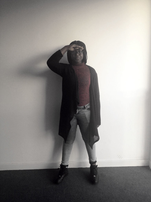
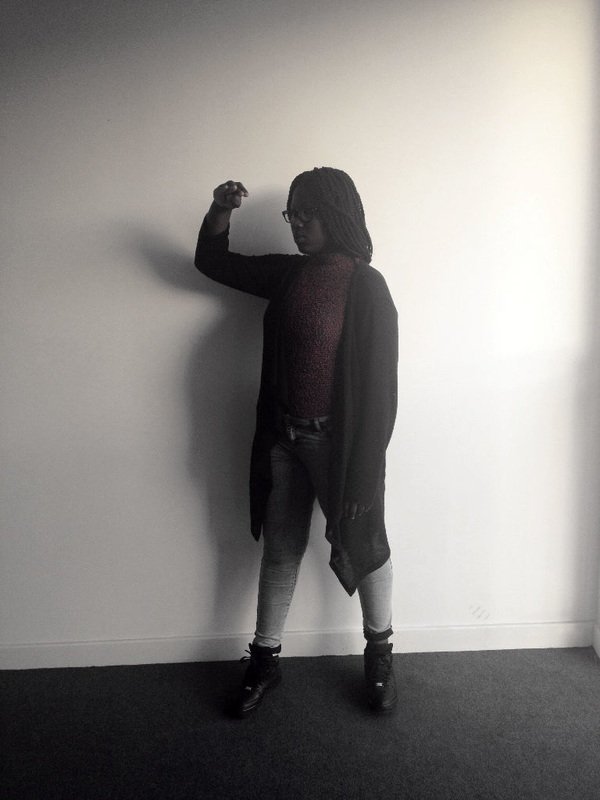
For this photo I took 3 different shots of my model. The first shot is of her with her hands at her forehead, so making a salute and with her legs apart. The second photo is of her slightly turned towards the left and her hand slightly moved away from her forehead. The last photo is of her body fully turned towards the left and her arm outstretched in front of her. I edited these photos by cropping, levelling the colours and by adding a filter called old photo. For the development I layered all the photos together and used the rubber tool to rub out all the parts of the photo I didn't want. After I copied the photo 3 more times and flipped them to create a mirror effect. Finally I added a filter called plastic wrap. I like this photo a lot because of the plastic wrap it makes the photo look 3D, so stand out. To improve this photo I could of only flipped the photo once instead of 3 times. From making this photo I have learnt that the filter used in your photo is very important for the overall look of the photo.
Idea 5 development
original shots
|
|

|
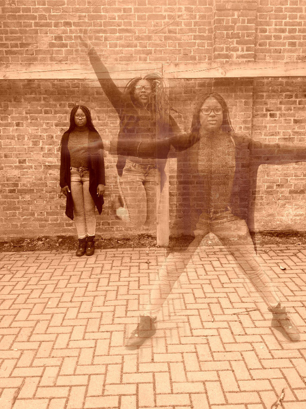


For this photo I had to take 3 shots to create the overall development. The first shot is of my sister standing in the far left corner with her hands by her side. The second photo is of her in the middle and jumping up in the air. The last photo is her standing closer to the camera, in the far right with her hands stretched out to her side and her legs wide apart. I edited these photos by cropping, levelling the colours and by adding sepia. For the development I layered all 3 shots together and used the rubber tool to rub out the parts of the photos i didn't want or need and I lowered the opacity. Next I copied the photo and flipped the photo to create a mirror effect. Finally I added a filter called poster edges. I like this photo a lot because of the mirror effect it makes the picture look really interesting. To improve this photo I could of used the natural colours and made them look bright to create a joyful and happy mood. From making this photo I have learnt that the colours used in your photo's are very important to create the right mood.
IDEA 6 DEVELOPMENT
Original shots
|

|
|


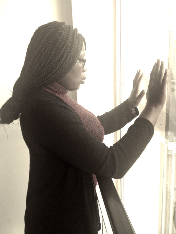
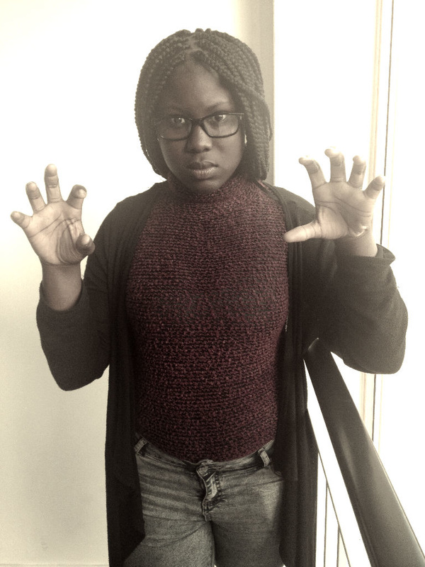
For this photo I took 3 shots to create my overall development. My first photo is of my model facing the window, with both her hands placed on the window, the second shot is of her head slightly turned towards the camera and the final shot is of her facing the camera and her fingers curled to look like claws. I edited these photos by cropping, adding black and white and by leveling the colours. For the development I layered all 3 shots together, I lowered the opacity and I used the rubber tool to rub out parts of the photo, I also used the liquify tool to pull, distort and liquify parts of my photo. Finally I copied the photo and flipped it to create a mirror effect. I really like this photo because of the liquify tool, it makes the photo look more creative and look fantastic and strange. To improve this photo I could of kept the photo natural or added sepia. From making this photo I have learnt that the tools you use to create your photos are always important to create an interesting and fantastic photo.
Idea 7 DEVELOPMENT
Original shots

|
|
|


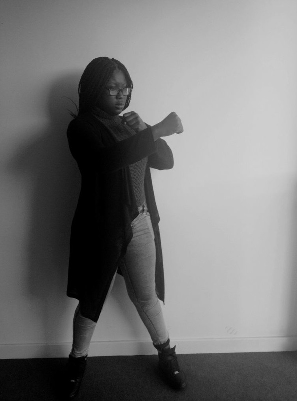
For this photo I had to take 3 shots. The first shot is of her with her hands fisted in front of her and her legs wide apart. The second shot is of her body slightly turned towards the right and her hands slightly moved away from her. The final shot is of her body turned towards the right and her right hand outstretched and her left hand slightly curled towards her. I edited these photos by cropping, levelling the colours and by adding black and white. I developed these photos by layering all 3 photos ontop of each other, I used the rubber tool to rub out the parts of the photo I don't want and I lowered the opacity. I then copied and flipped the photo to create a mirror effect. Finally I added a filter called plastic wrap and I also used a tool called liquify to liquify different parts of my pictures. I really like this photo because the photo looks 3D, so it stands out. To improve this photo I could of used sepia or left the colour in the photos. From making these photos I have learnt to always pick the right filter to create a fantastic and strange photo.
IDEA 8 DEVELOPMENT
Original shots
|
|
|
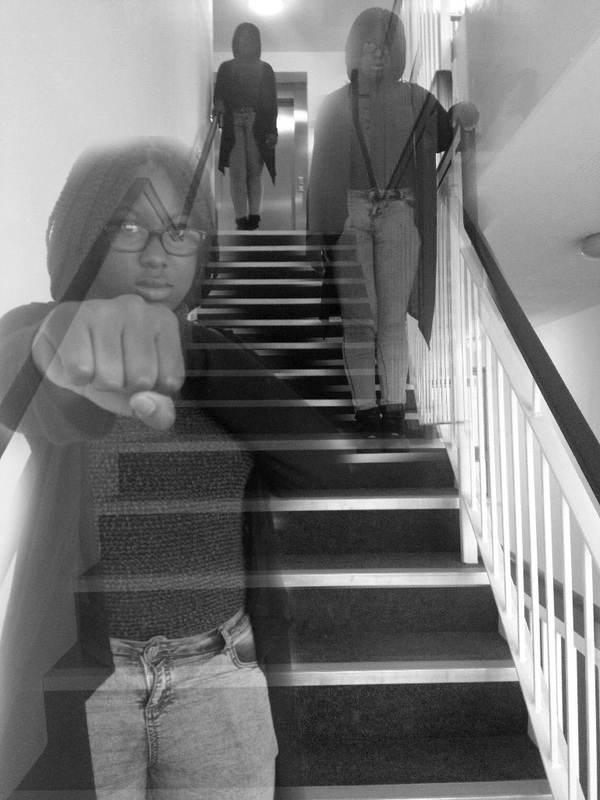


For this photo I took 3 different shots of my model on the stairs. The first photo is of my model standing at the top of the stairs on the left with her right hand holding the railing and her left hand by her side. The second photo is of her standing in the middle of all the stairs, towards the right, with her left hand holding the railing and her right hand by her side. The last photo is of her standing at the bottom of the stairs and with her fist pointed towards the camera. I edited these photos by cropping, adding black and white and by levelling the colours. For the development I layered all of these photos together and used the rubber tool to rub out parts of the photo I don't want and I also lowered the opacity. Next I copied and flipped the photo 3 times to create a mirror effect and finally I added a filter called poster edges. I like this photo a lot because of the filter, it makes the photo look sharp and also because of the mirror effect, the mirror effect created a lot of patterns. To improve this photo I could of added sepia or tried this photo out in a different location, maybe a bigger location. From making this photo I have learnt that the setting used is very important to give off the right mood and the filter is very important for the overall look of the photo.
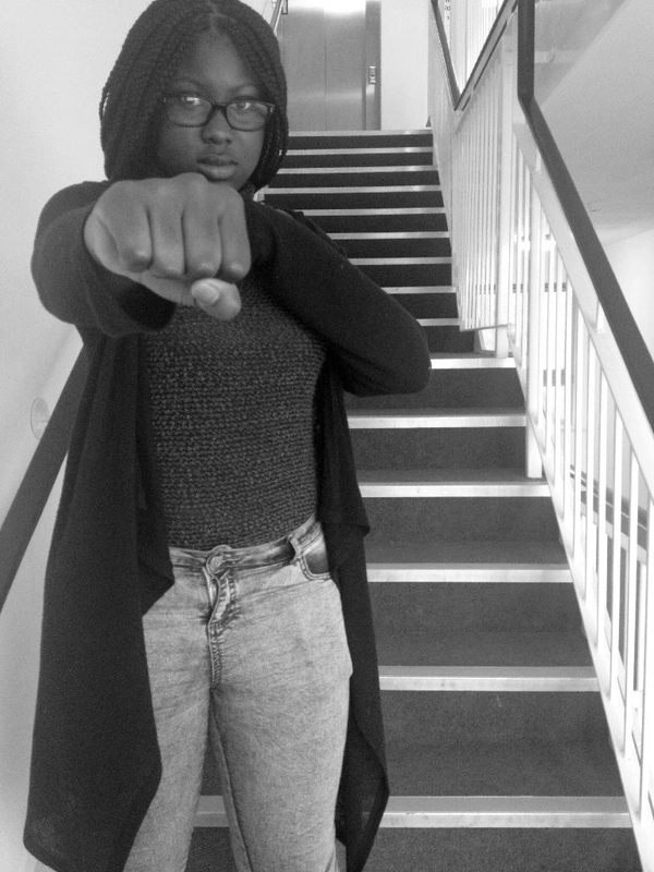
Idea 9 DEVELOPMENT
Original shots
|
|
|


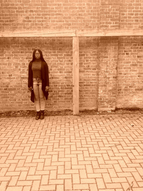
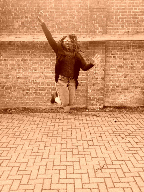
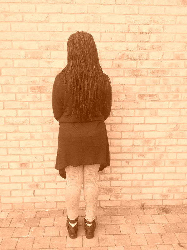
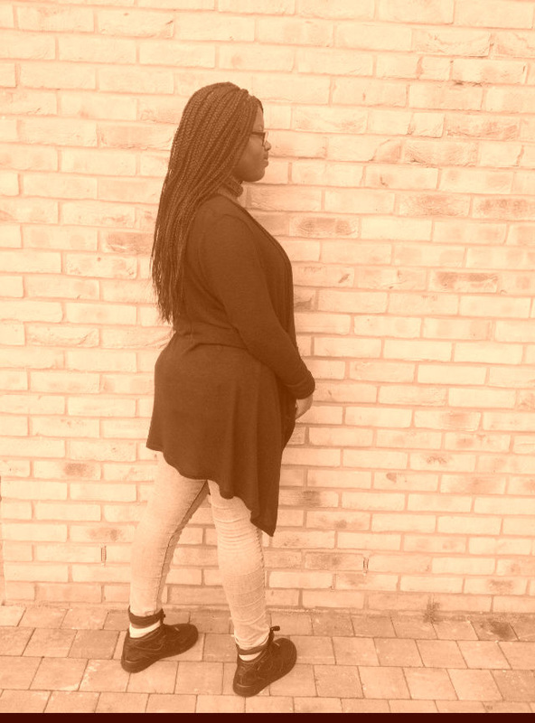
For this photo I took 3 shots of my model. The first shots is of her standing in front of a brick wall, facing the brick wall. The second shot is of her body turned towards the right, the third shot is of her facing the camera and her head slightly tilted to the right. I edited these photos by cropping, levelling the colours and by adding sepia. For the development I layered all the photos together, used the rubber tool to rub out different parts of the photo out and I also lowered the opacity. I also copied and flipped the photo, to create a mirror effect. Finally I added a filter called watercolour. I like this photo because of the dark colours, it stands out more and it looks sharp. To improve this photo I could of used different actions instead to make the photo even more interesting. From making this photo I have learnt that the colours used is very important to create a good photo.
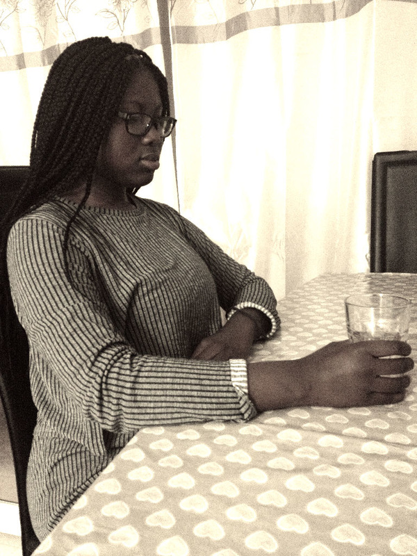
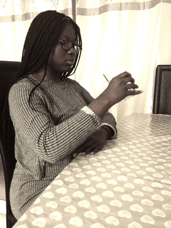
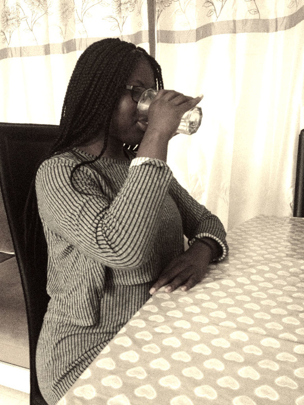
Idea 10 development
Original shots
|
|
|
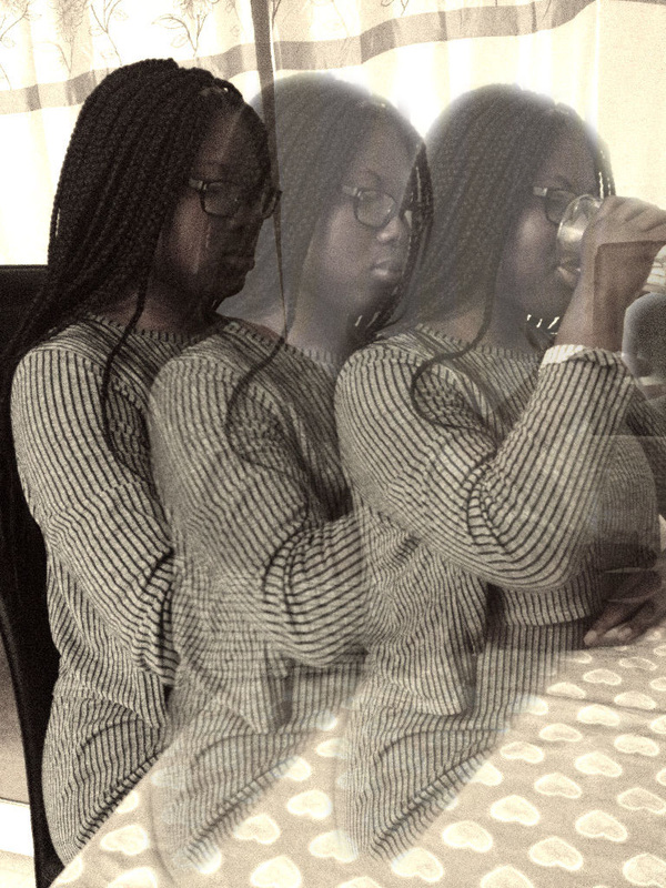


For this photo I took 3 shots of my model sitting at a table drinking water. For the first photo I had my model sit at a table facing the wall which is to the right of this photo, her hand stretched in front of her with a glass cup full of water in the glass. The second shot is of her sitting at the table, facing the wall and her hand holding the glass cup halfway to her lips. The final shot is of her sitting at the table, facing the wall and drinking the water from the glass cup. I edited these photos by cropping and levelling the colours. For the development I layered all the photos together, used the rubber tool to rub out parts of the photo that I don't want and I also lowered the opacity. Next I copied and flipped the photo to create a mirror effect and finally I added gradient map. I really like this photo because of the colours used and also because of the mirror effect, the mirror effect created a lot of patterns. From making this photo I have learnt that the colours used are very important for the overall look of the photo and also that the setting and spacing used is very important.
My Final Piece