Development 1 - Dan Mountford
|
Out of all my development 1's I believe that my development idea 6 is the best one. This is a picture of my sister wearing my dads coat and a hat layered onto the a picture of space. This was just a quick idea I came up with by using the style of Mountford. I made this photograph to try out his style and see how it would fit with my creativity. With this picture I took a picture of my sister wearing my dads coat and a hat and then I took a picture of space. On Photoshop I layered the picture of space on top of the picture of my sister. I then changed edited to hue and contrast. After I used the rubber tool to rub around my sister to create that outline effect. I then used a filter called plastic wrap. I'm happy with the result of this picture especially because of the outline it makes the picture a lot more interesting, I'm also glad with the layering as the picture of my sister is all black so it makes it look like a shadow lingering around. Also the filter helps to make the picture 3D which I really like. One thing I'm not happy about is the picture layered on top, if it was maybe a better picture then the picture all together would of looked extremely good. I learnt from making this photo, how to use a layer to create a certain mood or make a shadow.
|

I also learnt that the filter you use is very important for the whole image. Finally I learnt that something as simple as the rubber tool can really improve the picture and make it look really good.
|


Development 2 - Dan Mountford
|
Out of all my second developments I believe that my first development was the best one. This is a photo of Ansu's face and a picture of space layered in top of her face. I created this picture to show that I could develop my photos in the style of Mountford and to also see if I could do my own version of one of his photos that he made. With this photo the first thing I did was take a picture of space near my home then I took a picture of Ansu. Then on Photoshop I edited the photo of Ansu so that it wouldn't be too bright or too dark, right after I layered the picture of space on top of the first picture. I then used a tool on Photoshop that edits the layer, it changes the colour and the texture. After I selected the right one, the one I liked I pressed on the rubber tool. I used the rubber tool to rub out all the rest of the space photo so the photo fit in Ansu's face and so that it looked really realistic. I'm happy with this picture because it looks really realistic and it really does look like one Mountfords photos. I also like the brightness of this photo, as its not too bright or too dark. To improve this picture I could of used a better background. maybe a simple white background or a simple brick background. I could of also used a better filter to make the photo look better or even used a better space photo to be layered on top.
|

From this picture I learnt how to develop in the style of Mountford and how to use the rubber tool to make the photo look realistic and to clean up the photo too. I also learnt that the background is very important to create the right photo and the filter is just as important.
|


Development idea 3 - Dan Mountford
|
Out of all my development 3's I believe that my third development is the best. This is a photo of the side of a girls profile, shoulders to her head and a picture of space layered on top. I created this photo because I wanted to improve my skills on developing in the style of Mountford and because I wanted to do another version of my second development to make a better version using everything I'd learnt from making development 2. With this photo the first thing I had to do was take a picture of space. Next I had to find myself a model and when I did I took a picture of the side of her from her shoulders to her head. On Photoshop I edited the hue and saturation of the picture of my model and then I layered the picture of space on top. After doing this I edited the look of the layer so it wasn't too bright too dark or just didn't fit with the image I was trying to create, I then used the rubber tool. I used the rubber tool to rub out the rest of the space photo so that it only fit inside my models face and shoulders. I'm pleased with the outcome of the layering as it looks realistic but not as realistic as I wan it to. I also like the tile patterns on my models shoulders to her neck, this makes it look like they're her clothes. This picture needs a lot more editing to improve it. First of all I didn't use the rubber tool properly so that photo doesn't look realistic enough and the background that I chose wasn't a good on to pick. You can also see pieces of her hair, this really doesn't help it to make the picture look realistic.
|

Finally I should of made the layer of my model a bit more
clearer so it was mixed up with the picture of space. From making this photo, I learnt that you should learn from your mistakes the first time round and not make the same mistake. I also learnt that the background is very important for the whole look of the photo. |


Development idea 4 - Dan Mountford
|
Out of all my development 4's I believe that idea 1 is the best. This is a photo I made in the style of Dan Mountford and by also using some skills I learnt from developing in the style of another photographer I developed in before. I made this picture because I wanted to try out my own style but mix it with Mountfords and to also show what I had learnt from Mountfords pictures. For this picture I had to take picture of some models, both models were facing the left. I then took a picture of space. After taking the photos I went onto Photoshop to edit my photos. I brought up both pictures of my models, I adjusted the brightness, the contrast on both images and cropped it to get rid of all bits of the photos that ruined the photos. I also edited the picture of space and adjusted the brightness there too. Next I made a new page, and split the page into two, after I added the picture of space then I copied the picture onto it again. This time I flipped the picture to cause a mirror effect. After I added the picture of my models, one of the pictures of my models I flipped it to make it look like both models are looking at each other.
|

Next I used the rubber tool to go around both my models, to make them stand out. Finally I used an artistic filter to improve the picture. I'm pleased with the way this picture came out because the picture isn't too messy with too much going on and its not too bright or too dark either. From developing this photo I learnt that you should also use the skills you learnt from developing in the style of other artists to make the picture look really good.
|


Development idea 5 - Dan Mountford
|
Out of all my development 5's I believe that idea 6 was the best one. This is another one of the photo's I developed in the style of Mountford. I created this photo to develop my skills on Mountfords style and to also challenge myself by using two people instead of one. First thing I had to do was find myself some models, I took a picture of two of my friends sitting on a bench back to back. Next I took a picture of space to be layered on top. After I got my shots I then went on Photoshop to put the photos together. The first thing I did on Photoshop was edit the photos of my models. I cropped the photo, adjusted the brightness and contrast. I also blurred the background to get rid of unwanted background distractions and to make my models stand out. I also edited my space photo by adjusting the brightness and contrast. Next I layered the space photo on top of the photo's of my models then I used a tool which edits the brightness and texture of the layers. After I used the rubber tool to rub out the rest of the photo apart from the parts on my models, then I flattened the photo to merge the layers together to become one photo.
|

I'm pleased with the way this photo came out because its not too distracting as the background is blurred and also because its not too bright or too dark. To improve the picture I should of used a better picture of space to be layered on top. From making this photo I have learnt to use all your skills you have used before to create a great photo.
|


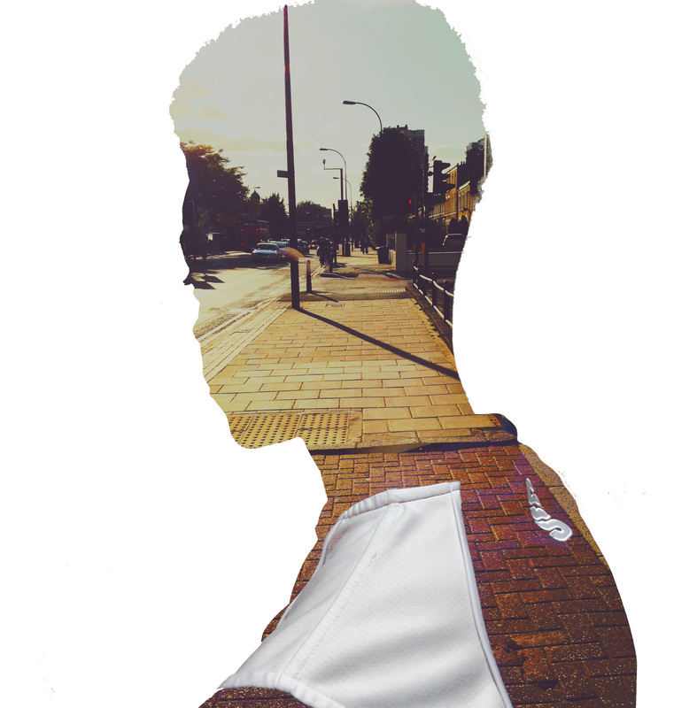
Development idea 6 - Dan Mountford
|
Out of all of my development 6 I believe that this picture is the best one out of all the 6 images. I chose this picture because it was pretty simple and it looked good, the colour isn't too dark or too dark so you can see both layers clearly making the picture look really interesting. This is a close up picture of a girls face(her eyebrows, her eyes and her nose) and a picture of space layered on top. The layer makes her look see through. I got the idea from one of Mountfords photos, where he layered a kite on top of the silhouette of a man, making it look as if the kite was the mans brain. I used that and made my photo look as if the picture layered on top is an insight into her brain. I created this photo because I wanted to try out my own version of one of Mountfords photos, I used his style also to show that I can develop in his style. The first thing I did was take a picture of space, so where things look like they're getting further and further away from you. Next I found myself a model and took a close up of her face. I then uploaded both of these pictures and a lot more to the laptop. I went on to Photoshop and started of with the picture of the girls face, I used level then I layered the picture of space on top. I then used a tool that changes the way the layers look. later I used hue and saturation to make the photo bright enough but not too bright. After I used the rubber tool to make it look as if the layer was only placed into the shape of her head.
|

I'm happy with the way this picture looks because it looks really realistic even though its a close up. My favourite part of this picture is the way the layer makes it look as if you're staring into her mind. From this development I have learnt how to use the rubber tool so that the layer only fits in a certain object or shape and to make the picture look very realistic. I will continue to use the rubber tool to make the picture look realistic and I might try and do a lot more close ups to improve my skills. To improve this picture I could of used her whole face or tried a different filter that stands out. Creating this picture made developing in Mountfords style a lot easier especially because I admired Mountford for his style and the way he makes the picture look realistic.
|


Development idea 7 - Dan Mountford
|
Out of all my development 7's I believe that idea 5 is the best one. This is another photo developed in the style of Mountford. I created this photo because I was happy with the developed picture of the close up (development 6) so I decided that I wanted to do another one. For this photo I had to find myself a model to take a picture of then next I took a picture of space. After taking the photo's I went on to Photoshop to edit it. With this photo not much was done to it. I edited the photo of my model by adjusting the brightness and contrast. Then I edited my space picture by adjusting the brightness and contrast too then I layered the picture of my model on top of my space photo. Next I used a filter to make an even better photo. I'm happy with the outcome of this photo because it does look good and because the filter created a shadow bringing depth to the whole photo.
|

I should of used a better more interesting picture of space, to make the picture really good. From developing this photo I have learnt that shadows are a really good idea to create depth.
|


Development idea 8 - Dan Mountford
|
Out of all my development 8's I believe that idea 2 is the best one. This is a photo I created in the style of Mountford. I created this photo because I wanted to experiment with different shapes and different styles and see if the outcome would still fit with Mountfords style. For this photo I had to first find myself a model, after taking a picture of my model I took a picture of space too. On Photoshop I edited the picture of my model by cropping it and adjusting the brightness and contrast. I also did the same for my space photo. After adjusting my photos, I layered my space photo on top of the photo of my model. I used this tool to adjust the texture and brightness of
the layer that has been layered on top. Next I used the rubber tool to get rid of the space photo apart from the bits that covered my models face. Finally I used a tool called 'Kaleidoscope' to get that flower effect. I'm happy with the way this photo came out because it looks really good and looks really creative. I also like the fact that it's still within Mountfords style. To improve this picture I should of used a better space photo to make it look even better. I've learnt, from developing this photo to try out crazy and wild effects, you might end up liking the outcome. |

I've also learnt that a simple background is really effective and is better than a clustered background with too much distractions.
|


Development idea 9 - Dan Mountford
|
Out of all my development 9's I believe that idea 5 is the best. This is a photo I created in the style of Mountford. I created this photo because I wanted to further my skills in developing in the style of Mountford. With this photo I took a photo of my models/ my friends sitting on a bench back to back. Then I took a picture of space. Next I went on Photoshop to edit the photos. First I edited the photo of my models by adjusting the brightness and by cropping the photo and then I did the same to my space photo. After editing my photos, I layered the photo of space on top of my models photo. I then adjusted the brightness on the layer and the texture, I made sure that you could see both the space photo and my models. Next I used the rubber tool to rub out the space photo apart from the parts of the photo that covered my models. Finally I used a filter that caused a slight darkness to the photo. I'm happy with the outcome of this photo because it does look good and realistic and also because the filter gives it depth. To Improve this photo I should of used a better space photo. I should of also made sure the background wasn't clustered or I should of burred the background. As a result of making this photo I have learnt to make sure the background is clear and there are no distractions.
|

And finally if there is a clustered background blur the background or take another photo.
|


Development idea 10 - Dan Mountford
|
Out of all my development 10's my favourite or my best one I believe is idea number 4. This is a photo I developed by using skills I had learnt from developing in the style of other artists and by also using Mountfords style of double exposure. I created this photo to prove to myself that I could use other artists styles and use Mountfords style, and it would work. With this photo I took a picture of my model wearing a long black coat and looking at he floor and a picture of someone's eyes. Then I took a picture of space. On Photoshop I edited the picture of my model first by cropping and adjusting the brightness and I also did the same to my space photo and eye photo. After editing the photo's, I layered the picture of my model on to my picture of space and then layered the photo of the eye. I adjusted the brightness and contrast. Next I flattened the photo, to join all three photo's together. Then I used the rubber tool to cause the white outline around my model, blurred the background and finally using a filter called 'plastic wrap' to cause that 3D effect. Next I opened up a new page and split the page into 4. I then added my development in the first space, I did this for the last 3 spaces but flipping and reversing to create that mirror effect. I really like the outcome of this photo because the filter helps to make the photo look 3D and the mirrored effect caused a set of eyes. The mirror effect also created some crosses and patterns which adds to the creativity. I also like the white line as it makes my model stand out amongst the picture. To improve this photo I could of used a better more interesting space photo.
|

From developing this photo I learnt to use all your knowledge of other artists styles to create a good photo and to also use the flip and reverse Technique to create patterns. I've also learnt that when choosing the filter you must pick the right one to create the effect you want for example a 3D effect.
|


Developments - Dan Mountford