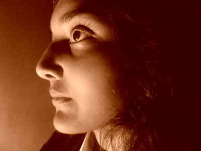
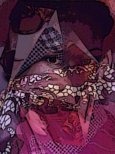
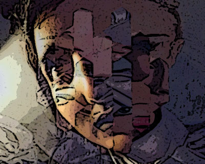
Idea 1
|
|
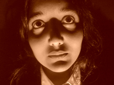
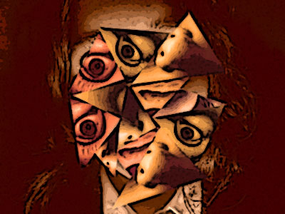
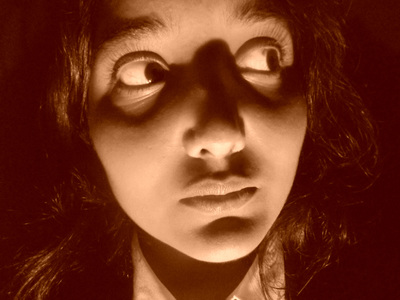
For this photo I placed my model in a dark room and positioned a lamp in front of her face to create shadows around her face, next I uploaded this photo and edited it. I edited this picture by adding cropping, levelling the colours and adding sepia. Next to develop in the style of Jeremy Olson I had to use the polygonal lasso tool to create triangle and fill them up in different colours using photo filter. After I placed all the triangles around her face I went onto filter gallery and used poster edge. I like this photo a lot because it reminds me of some of Jeremy Olson's work and I like how the colours used all fit together well. To improve this photo I could of used a filter that wasn't too heavy so it would be able to see all the different face parts. From making this photo I have learnt to use the correct colours to develop my pictures, I have also learnt to use lighting to improve the pictures.
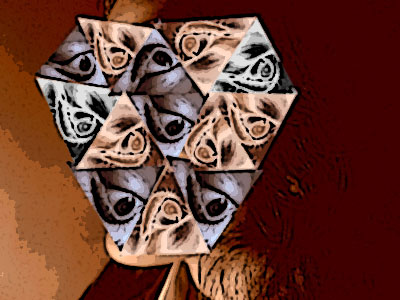
Idea 2
|
|
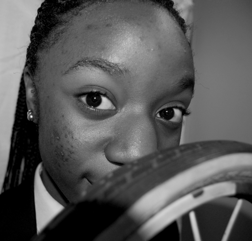
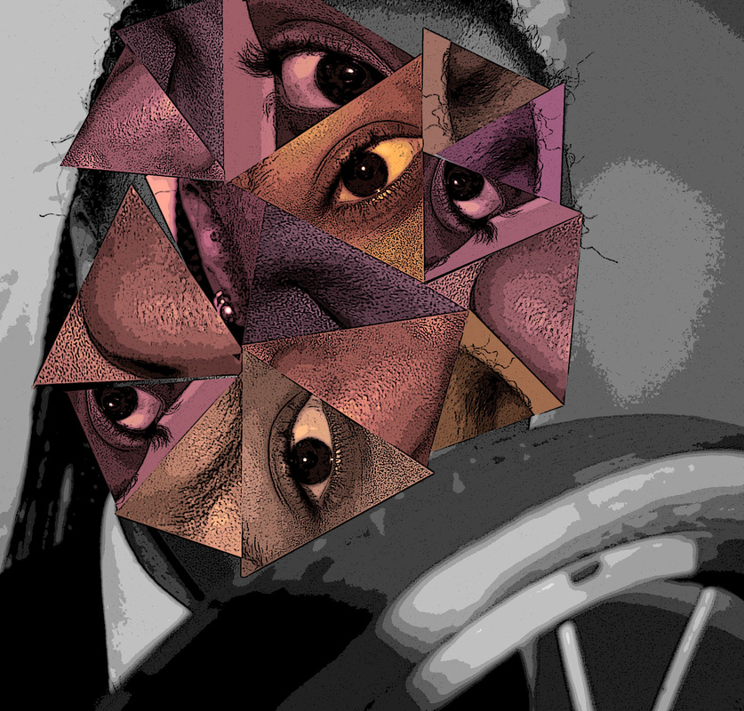
For this photo I placed my model behind a white background and used a prop to place in front of her face, in this case a bicycle wheel. Next I uploaded this photo and preceded by editing her photo, by cropping and adding black and white. I also used the polygonal lasso tool to create triangle and copy and paste so that I can move these triangles filled with a certain part of her face around, after that I used photo filter to fill the triangles in a certain colour, in this case I used light subtle colours to go against the black and white. My last edit was by going on filter gallery and by adding poster edges. I like this photo a lot because it's clear and you can tell that it is in the style of Jeremy olson. To improve this photo I could of used a different colour maybe a darker colour or for a change I could of used circles or squares instead of triangles. From making this photo I have learnt that the colours and filters you use in the photo can change the look drastically and to pick the right colours for the look you're going for.
Idea 3
|
|
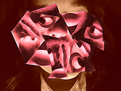
For this particular photo I placed my model in a dark room in front of a black background, after that I moved a lamp around her face to create shadows. Next I uploaded the photo and edited it by cropping the photo, adding sepia and by using the polygonal lasso tool to create triangles to fit around her face which I filled in pink using photo filter. The last edit was by going onto filter gallery and adding pallette knife. I like this photo because of the colours, the pink and the brown works well together and it sort of has a surreal sense of feeling to it. To improve this photo I could of used a better filter as this filter may seem too heavy which makes it hard to see the different parts of her face. From this photo I have learnt that you must pick the right filter to create the best photo.
Idea 4
|
|
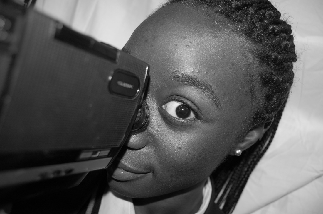
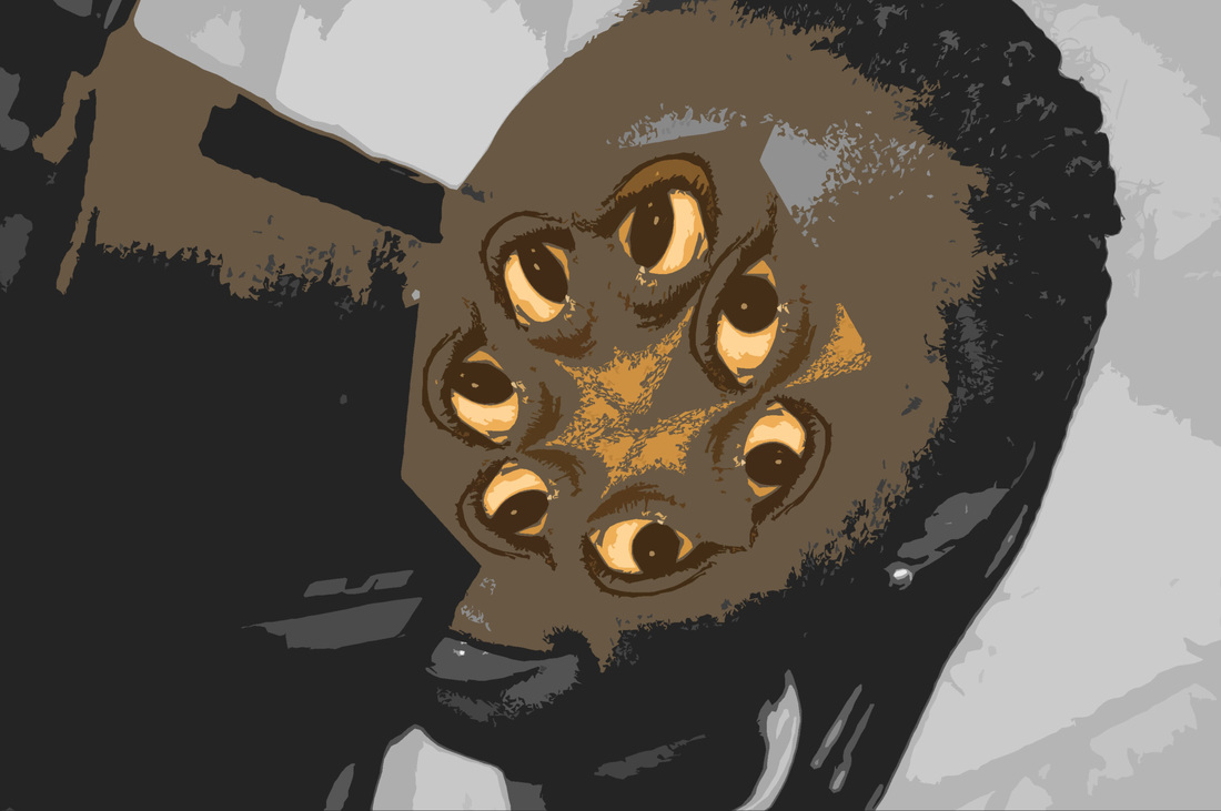
For this photo I placed my model in front of a white background and she placed an old camera in front of her eye. I uploaded this photo and edited it by cropping, adding black and white and by also using the polygonal lasso tool to create triangles around her face, I also used photo filter. After I went onto filter gallery and used poster edges. I like this photo because it's definitely strange to improve this photo I could of used different colours instead of the yellow.
Idea 5
|
|
For this photo I placed my model in a dark room and behind a black background and then placed a lamp in front of her face to once again create shadows around her face. I uploaded this photo and edited it by cropping, adding sepia and levelling the colours. Next I used the polygonal lasso tool to create triangles, in some of the triangles it was filled in using photo filter or sepia. Finally I went onto filter gallery and used poster edges. I like this photo because it's interesting and I like the colours that were used. To improve this photo I could of moved the triangles around her face to fit it more around the shape of her face. From this photo I have learnt that you must always pick the right colours to be used in your photo.
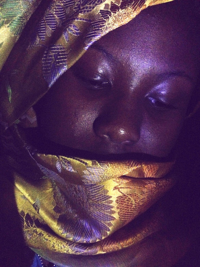
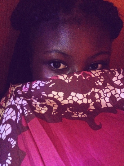
IDEA 6
|
|
For this photo I placed my model in a dark room and wrapped a yellow scarf around her head and also covering her mouth. I placed a blue light in the corner of her face, which caused a dark shadow all around her face and behind her. This makes her face and the yellow scarf stand out. I uploaded this photo and edited it by cropping and levelling the colour. I uploaded one of Jeremy Olson's photos and layered it on top of my photo. I then edited the layered photos by lowering the opacity so that my picture was seen more than Jeremy Olson's photo. I like this photo because of the colours from both of the photos as they blend well together.
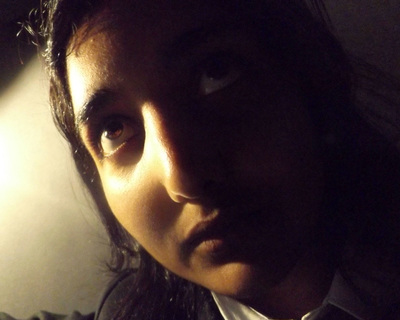
IDEA 7
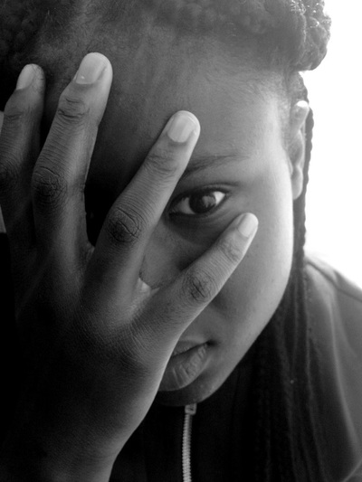
|

|
For this photo I sat my model at a windowsill and used the natural light from the sun to improve the photo. The sunlight is pointing onto the right side of her face. My model also used her hands to cover up half of her face and only left a bit of her face and her eyes visible. I edited this photo by cropping, levelling the colours and by adding black and white. I then layered one of Olson's photos onto my photo and layered the opacity, I then flattered the photo. I like this photo because I like the way the colours blend well together and the way it pulls of a dark, sombre feeling to it.
IDEA 8
|
|
For this photo I placed my model in a room in front of a wooden door. I then turned on an orange light, put it further away so that only a bit of that light affected my photo and then I used a blue torch and pointed it unto her face. I then used a pink umbrella with patterns and placed it in front of her face covering the lower half of her face. I then edited this photo by cropping and levelling the colours. Next I layered one of Olson's photos onto my photo and lowered the opacity and flattened the image. After that I went unto filter gallery and used a filter called poster edges. I like this photo a lot because the filter makes the photo look sharper and makes it stand out.
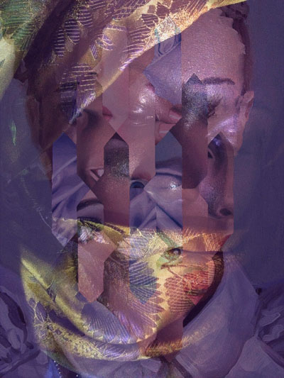
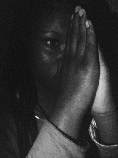
IDEA 9
|
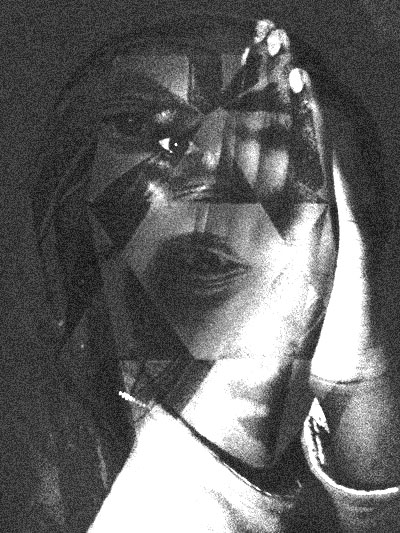
|
For this photo I placed my model in a dark room and had her make praying hands in front of her face, the angle I shot the photo at only half of her face was visible. I then used a torch to point unto her so that all round her would be dark and her face would stand out. I edited this photo by cropping and levelling the colours, I also added black and white unto the photo. I then layered one of Olson's photos onto my photo and lowered the opacity, then I flattened the photo. I then used a filter called film grain. I like this photo because of the dark feeling I get from this photo, it makes the photo very interesting and creative.
IDEA 10
|
|
For this photo I placed my model into a dark room and placed a lamp on the floor pointing up at her. This caused shadows on the left side of her face. I then edited this photo by cropping and levelling the colours. I then layered one of Olson's photos onto my photo and lowered the opacity, then I layered the photo. Next I went unto filter gallery and used a filter called poster edges. I like this photo because the filter makes the picture stand out and the equal mixture of my photo and Olson's photo creates a very interesting and creative photo.
